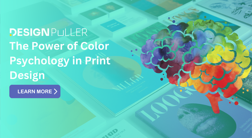
The Power of Color Psychology in Print Design
Have you ever wondered why certain advertisements catch your eye while others fade into the background? The secret might be hiding in plain sight—it's all about color. 🎨 In the world of print design, color isn't just a visual element; it's a powerful tool that can evoke emotions, influence decisions, and leave a lasting impression on your audience.
Imagine walking into a store and being drawn to a particular product simply because of its packaging color. Or picture yourself flipping through a magazine, your attention instantly captured by a vibrant advertisement. That's the power of color psychology in action. But how can designers harness this power to create more effective print materials? 🤔 In this blog post, we'll dive deep into the fascinating world of color psychology and its application in print design. From understanding the emotional impact of different hues to mastering color theory basics, we'll explore how you can leverage the science of color to create designs that not only look good but also resonate with Understanding Color Psychology.
Definition and importance in design
Color psychology is the study of how colors affect human behavior, emotions, and perceptions. In print design, it plays a crucial role in creating visual impact and conveying messages effectively. Understanding color psychology allows designers to manipulate emotions, guide attention, and enhance brand recognition.
Historical context of color symbolism
Throughout history, colors have held symbolic meanings across various cultures and civilizations. For example:
# Red: Associated with power, passion, and danger
# Blue: Symbolizes trust, calmness, and stability
# Green: Represents nature, growth, and harmony
# Yellow: Signifies happiness, optimism, and energy
This historical context continues to influence modern color choices in print design, creating a rich tapestry of meanings that designers can leverage.

Cultural variations in color perception
Color perception varies significantly across cultures, influencing how different audiences interpret and respond to designs. Consider the following cultural differences:
|
Color |
Western Perception |
Eastern Perception |
|---|---|---|
|
White |
Purity, weddings |
Mourning, funerals |
|
Red |
Danger, passion |
Good luck, prosperity |
|
Purple |
Royalty, luxury |
Mourning (in some cultures) |
|
Green |
Nature, go |
Infidelity (in China) |
Understanding these cultural nuances is essential for creating globally appealing print designs and avoiding unintended negative associations. Designers must research and adapt their color choices based on their target audience's cultural background to ensure effective communication. The Emotional Impact of Colors.
Now that understand the basics of color psychology, let's explore how different colors can evoke specific emotions and reactions in viewers.
A. Warm colors and their effects
Warm colors, such as red, orange, and yellow, are known to stimulate and energize. They can create feelings of excitement, enthusiasm, and comfort.
|
Color |
Emotional Impact |
|---|---|
|
Red |
Passion, energy, urgency |
|
Orange |
Creativity, enthusiasm, friendliness |
|
Yellow |
Optimism, happiness, clarity |
B. Cool colors and their influence
Cool colors like blue, green, and purple tend to have a calming and soothing effect. They can evoke feelings of trust, serenity, and professionalism.
# Blue: Trustworthiness, stability, depth
# Green: Growth, harmony, balance
# Purple: Luxury, mystery, creativity
C. Neutral colors and their role
Neutral colors, including black, white, gray, and beige, provide balance and sophistication. They often serve as a backdrop for other colors or create a sense of timelessness.
D. Color combinations and emotional responses
Combining colors can create complex emotional responses. For example:
# Red and blue: Dynamic tension between excitement and calm
# Yellow and green: Fresh, natural feelings
# Black and gold: Luxury and elegance
Understanding these emotional impacts is crucial for print designers to effectively communicate brand messages and evoke desired responses from their audience. Next, we'll explore how to apply this knowledge in practical print design scenarios.
Applying Color Psychology in Print Design
Now that we understand the emotional impact of colors, let's explore how to apply color psychology in various print design contexts.
Logo Design and Brand Identity
When creating logos and establishing brand identities, color choices are crucial. A well-chosen color palette can instantly communicate a brand's personality and values. For example:
|
Color |
Brand Association |
Emotional Impact |
|---|---|---|
|
Blue |
Trustworthiness |
Calm, Stability |
|
Red |
Excitement |
Energy, Passion |
|
Green |
Nature, Growth |
Health, Freshness |
Marketing Materials and Advertisements
In marketing materials, colors can significantly influence consumer behavior. Use bold, contrasting colors to grab attention in advertisements, while ensuring they align with your brand's overall message.
Packaging Design
Packaging colors can make or break a product's appeal on store shelves. Consider:
# Using warm colors for food packaging to stimulate appetite
# Employing cool colors for tech products to convey sophistication
# Incorporating earth tones for organic or natural products
Magazine and Book Covers
Cover designs should reflect the content within while standing out on newsstands or bookshelves. Experiment with:
# Vibrant colors for lifestyle magazines
# Muted tones for literary works
# Bold contrasts for mystery or thriller novels
Infographics and Data Visualization
Colors play a vital role in making complex information easily digestible. When creating infographics:
# Use contrasting colors to highlight important data points
# Employ a consistent color scheme throughout for cohesion
# Consider color-blind friendly palettes for accessibility
By applying color psychology principles across these print design areas, you can create more impactful and effective visual communications that resonate with your target audience.

Color Theory Basics for Print Designers
Now that we've explored the application of color psychology in print design, let's delve into the fundamental principles of color theory that every print designer should know.
Color Wheel and Relationships
The color wheel is an essential tool for understanding color relationships. It consists of primary, secondary, and tertiary colors arranged in a circular format. Here's a simplified representation:
|
Primary Colors |
Secondary Colors |
Tertiary Colors |
|---|---|---|
|
Red, Blue, Yellow |
Green, Orange, Purple |
Yellow-Green, Blue-Green, Blue-Purple, Red-Purple, Red-Orange, Yellow-Orange |
Understanding these relationships helps designers create harmonious color schemes and effective contrasts in their print designs.
Color Harmonies and Schemes
Color harmonies are pleasing combinations that create visual interest and balance. Some common color schemes include:
# Monochromatic: Various shades and tints of a single color
# Complementary: Colors opposite each other on the color wheel
# Analogous: Colors adjacent to each other on the color wheel
# Triadic: Three colors evenly spaced on the color wheel
Color Contrast and Legibility
Contrast is crucial for readability and visual impact in print design. Consider these contrast types:
1. Hue contrast: Using different colors
2. Value contrast: Light vs. dark
3. Saturation contrast: Vivid vs. muted colors
Proper contrast ensures that text and design elements are easily distinguishable, enhancing overall legibility.
Color Balance and Proportion
Achieving the right balance and proportion of colors in a print design is key to creating visually appealing and effective compositions. Consider the 60-30-10 rule:
# 60% dominant color
# 30% secondary color
# 10% accent color
This guideline helps create a harmonious and balanced design that guides the viewer's eye effectively.
# Pink: Femininity, youthfulness
# Gold: Prestige, high-end products
# Purple: Creativity, royalty
C. Financial and Corporate Documents
Financial institutions and corporations often use colors to convey trust and stability:
# Blue: Trustworthiness, professionalism
# Green: Growth, wealth
# Gray: Balance, calmness
D. Environmental and Sustainability Communications
For eco-friendly messaging, designers typically opt for:
# Green: Nature, sustainability
# Brown: Earth, organic
# Blue: Clean water, air quality
By tailoring color choices to specific industries, print designers can effectively communicate brand messages and evoke desired emotional responses from their target audience. Next, we'll explore methods for testing and optimizing these color choices to ensure maximum impact.
Testing and Optimizing Color Choices
Now that we've explored various aspects of color psychology in print design, let's delve into the critical process of testing and optimizing your color choices to ensure maximum impact.
A/B Testing in Print Design
A/B testing isn't just for digital mediums; it's equally valuable in print design. By creating two versions of your print material with different color schemes, you can gauge audience reactions and preferences. This method helps refine your color choices based on real-world feedback.
|
Version A |
Version B |
|---|---|
|
Primary color: Blue |
Primary color: Green |
|
Accent color: Orange |
Accent color: Purple |
|
Background: White |
Background: Light Gray |
Color Accessibility Considerations
Ensuring your print designs are accessible to all audiences is crucial. Consider color blindness and contrast ratios when selecting your palette. Here are some key points to remember:
# Use high contrast between text and background colors
# Avoid relying solely on color to convey information
# Test your designs with color blindness simulation tools
Adapting Colors for Different Print Mediums
Different print mediums can affect how colors appear. Consider these factors:
# Paper quality and finish (glossy vs. matte)
# Printing process (digital, offset, or screen printing)
# Ink absorption rates
Adjust your color choices accordingly to maintain consistency across various print materials.

Analyzing Competitor Color Strategies
Studying your competitors' color choices can provide valuable insights. Create a competitive analysis by:
1. Collecting samples of competitors' print materials
2. Identifying common color themes in your industry
3. Looking for opportunities to differentiate your brand through unique color combinations
By continuously testing and optimizing your color choices, you'll create more effective and impactful print designs that resonate with your target audience.
Color psychology plays a crucial role in print design, influencing emotions, perceptions, and behaviors. By understanding the emotional impact of different hues and applying color theory basics, designers can create powerful visual communications that resonate with their target audience. From industry-specific applications to strategic testing and optimization, the thoughtful use of color can significantly enhance the effectiveness of print materials.
As you embark on your next print design project, remember that color is more than just an aesthetic choice – it's a powerful tool for conveying messages and evoking desired responses. Take the time to research and consider the psychological implications of your color palette, and don't be afraid to experiment with different combinations to find the perfect balance for your specific goals and audience.